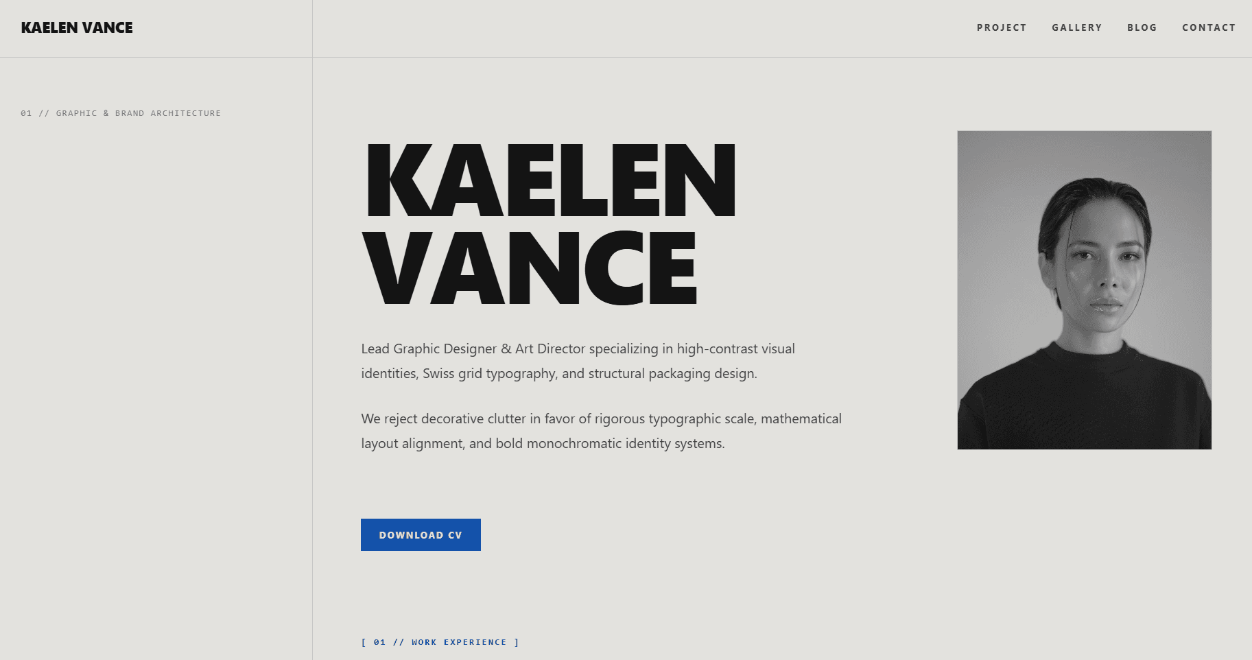
This template is for who want a professional site without building from scratch. Profile, work and education history, a project showcase, a photo gallery, and a blog are all included. Everything is editable through Sanity Studio. SEO metadata and responsive layout are handled automatically from whatever you put into the CMS.
Key features
- CMS-managed content. All sections, including profile, projects, blog, gallery, and work history, are managed through Sanity Studio without touching code.
- Integrated blog. Post listing, individual post pages, publish dates, excerpts, and rich text with headings, blockquotes, inline images, and inline code.
- Project showcase. Featured project cards with cover image and description, plus a full directory index. Each project has its own case study page.
- Photo gallery. A square grid with a lightbox modal, keyboard navigation, and a grayscale-to-color hover effect on images. The homepage shows a preview of six; the gallery page shows all of them.
- Work and education timeline. Each entry uses a two-column layout: period on the left, role and description on the right. Both work history and education support optional per-item descriptions.
- Responsive navigation. Desktop has a horizontal header. Mobile gets a full-screen overlay menu with numbered items that closes on page change.
- Automatic SEO metadata. Every page generates title, description, Open Graph, and Twitter Card data from Sanity. Blog posts include publish date in the Open Graph output. The favicon is set from site settings.
- Real-time content. Built on next-sanity's Live Content API. Studio changes appear without a rebuild.
Pages included
- Home: hero/about, experience, education, featured projects, gallery preview,
- blog preview, contact
- Projects: full directory listing
- Project detail: individual case study per project
- Blog: full post archive
- Blog post: individual article page with rich text rendering
- Gallery: full image archive
- Studio: Sanity Studio at /studio
Design style
The design follows a strict Swiss International Style. No border radius anywhere in the layout. The palette is cream background, cobalt blue accent, and jet black text. Every page uses a 12-column CSS grid with a sticky left sidebar (3 columns) and a 9-column content area. Typography pairs General Sans for headings and body with Space Mono for labels and metadata. Headings use fluid sizing with tight letter-spacing.